Pearson’s MyLab IT: Proposed Interface Redesign
User Experience Research
July & August 2021
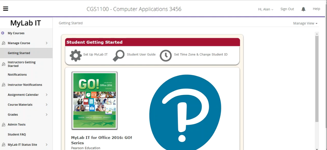
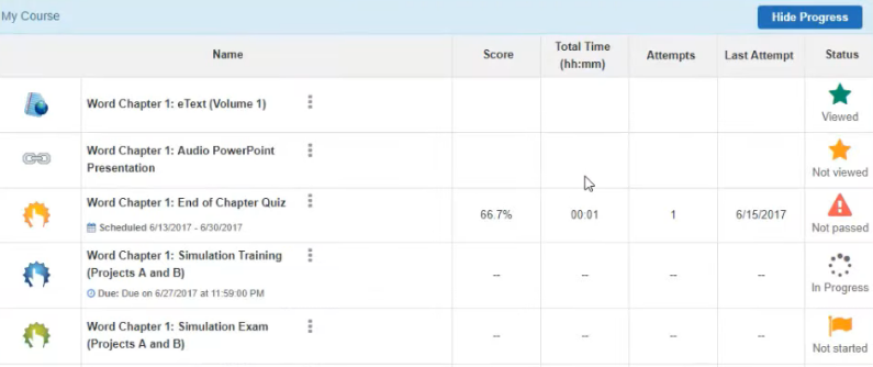
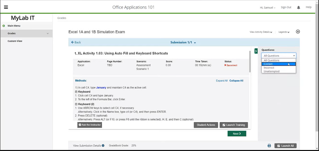
Pearson currently offers MyLab IT for Information Technology courses. The software centralizes access to some of Pearson’s most popular technologies, including Simulations and Graders. These allow students to gain hands-on experience with a variety of Microsoft’s programs (for example, Excel). Although MyLab It is undoubtedly useful for students, its interface is currently unorganized and visually outdated. This redesign aimed to remedy some of these problem areas.
Current interface
Aspects of the redesign
Software/Tool(s) for design: Microsoft PowerPoint
-
During my internship with Pearson, the company launched an innovative and affordable way to use textbooks: Pearson+ (Pearson Plus). The style of the MyLab IT redesign was meant to be inline with the aesthetic of this new product, as to create one overall cohesive and aesthetically pleasing style across Pearson products and services.
-
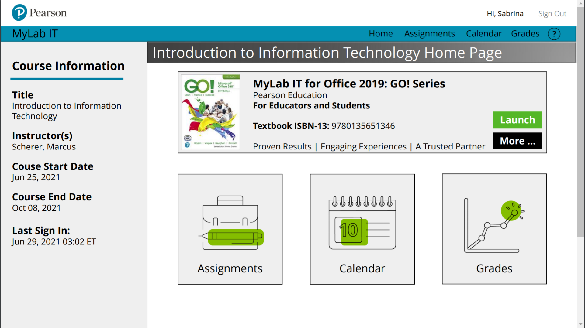
One aspect of a strong interface is the ability to stay true to what the user is already familiar with and what they may expect to see in the given context. In this case, the interface redesign is meant to stay true to the existing navigation bar and the overall features that students can access through the software. At the same time, major pieces like grades, calendar, and assignments are highlighted and immediately accessible as soon as the student selects their course.
-
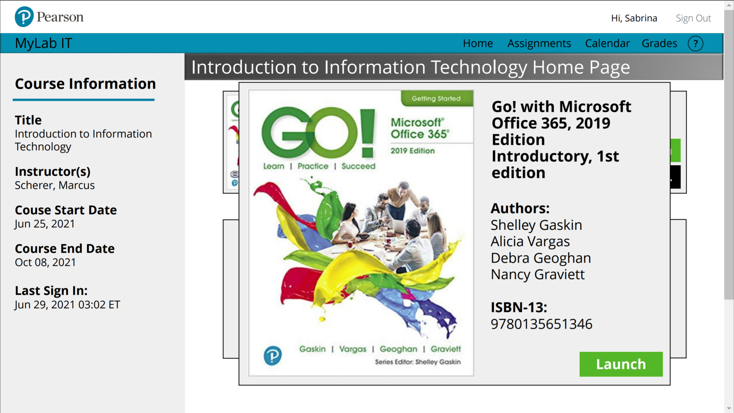
Currently, access to a given course’s textbook is separate from its Simulators and Graders, The proposed redesign aims to centralize all course tools into one space that is accessible from the course’s home page.
Pearson+

In August 2021, Pearson launched a subscription plan for textbooks, Pearson+. This product aims to offer a low-cost subscription model for over 1,500 e-textbooks. The interface of Pearson+ aims to provide a sleek and modern display of options. This was the core of the visual decisions made in the proposed interface.
Image from The Verge
Proposed Interface
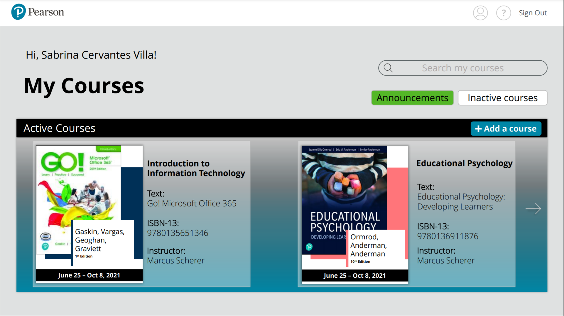
In line with Pearson's newest product launch, Pearson+, the interface utilizes a similar gradient and on-brand colors. This image demonstrates use of a carousel which students can cycle through to open a particular course.
The current design does not centralize all the software's assets in one place. The redesign aimed to remedy this, while additionally offering the assets in the top navigation bar - as to make them available from anywhere in the software.
Currently, access to the course e-text is located separately. The proposed redesign would centralize access to the text on top of the software-specific assets (like Assignments, for example).
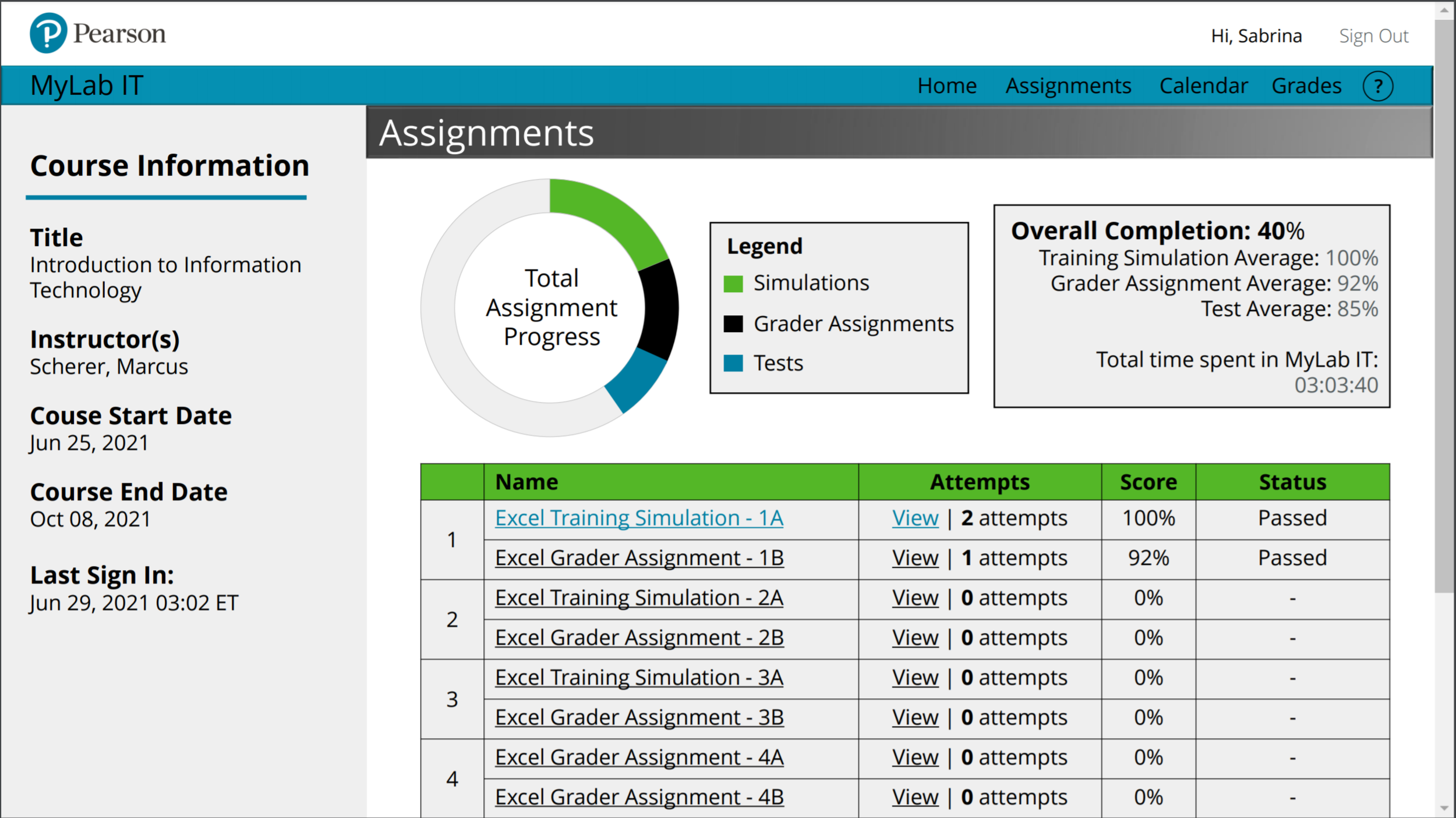
Although the current design does offer a similar table of information per assignment, clicking on any spot in the table will always launch the respective Simulator. The proposed redesign adds direct links to each respective piece of information as well as a visualization of student progress in the course.

